Monday 7 January 2013

Lecture 9- Text and Image


The last ITAP lecture was a bit different and challenging, as we had to figure out the key principles ourselves.

In this blog post I will talk about how text compliments images and vice versa.
As a visual communicator using text along with images can greatly increase the impact which you will have on your targeted audience. This is because the two complement each other so well and can convey a message in a very simple, straight forward manner. Illustrators often put great emphasis on text and images from publications and create handmade images; whereas Graphic Designers are more computers based.
Without words, images can be seen as bare and the audience may not always understand what you are trying to say; so with the use of text you can instantly gain an audience’s attention, as they will suddenly relate to the image being portrayed.

Designers are very clever and use text which doesn't always compliment the picture. This is done because they aim to alter the meaning of the picture and make the audience think differently to what is actually being said or seen. So not everything you see is necessarily true! At the lecture we were shown a variety of different images and the ones below inspired me the most, as I thought they were very catchy and the message behind them really made you think. The photographs were taken by Gillian Wearing called, "The signs what you want to say, not what someone else wants you to say", behind the signs are individuals who are going about their daily life. However when they put the signs up you can tell that they are not necessarily happy in what they are doing; as the signs say something totally different to their facial expressions and body language.

Gillian Wearing Series
Images of individuals put on the spot to say the first thing on their mind about how they feel.
By Gillian Wearing


Images can only tell you a story according to your own personal observations and how you perceive them. Each image can be taken by a different meaning and this all depends on how and why you think in that certain way. This is the reason why text is needed along side images, so that everyone understands the meaning of them and the same message is being conveyed across to all the audience.

Lecture 8- Production for Designers

Principle 3- The Design Workflow
The design workflow is a process which you must ensure you go through before starting a project. This is the best way to think outside the box and give more than what the brief is asking you to do. Another reason behind carrying out the design workflow is to have a better understanding of the task, as the more knowledge you have the better your final outcome will be.
 I will now talk about the design working method which I have been referring back to whilst working on my project. The project brief was to produce a digital magazine as a group about anything relating to Birmingham. We chose to look at something different and look at homelessness in the city, as this seemed to be quite an awakening issue.

 The design workflow chart I referred back to was the diagram below. Design Workflow
I chose this one as I thought it's clear, straight forward and very easy to follow. The simple structure allows you to work step by step and not get confused as to what you are doing. I think it has a very good flow to it and helps you widely during the time of working through your RVJ's. Staring from the main point which is the brief, allows you to think and brainstorm anything and everything in relation to your project. I followed this method and done a brainstorm of Birmingham, we did this to let ourselves lose and think about anything which could be an interesting part of the city.

 By doing this we gathered a lot of ideas and put them all together to agree on one final idea, which we would base out magazine on. We first agreed on looking at the distinction between day and night life in Birmingham and how peoples lives change during the day and night. However we then decided that this was not a strong subject to base our magazine on; as we asked ourselves question like- would you read the magazine? would you pay to buy this magazine? what do we find interesting about the magazine? As we weren't too keen on the subject area we were looking at, we then decided to change it to something unique and started to gather primary and secondary research on the homeless people in Birmingham.

For primary research some of the group members went out to interview homeless people at the homeless shelters and banks and also people who sell the Big Issue in the town centre. Whereas for secondary research we looked at artists and other visual communicators who's work we though linked in to ours. For example Lee Jefferies photographs have great emphasis on the homeless, as he takes close up shots of just their faces; through which you can see every little detail. I thought this was very unique and added some photographs into my own research. Gradually we go towards producing examples and rough sketches of what our final outcome will be about and get finalizing the selection stages. All in all i thought that this was a very simple design workflow to follow and helped and guided me alot during the whole project.

The Novice to Expert
The novice to expert is a diagram which shows you what you need in order to become an expert. The diagram was shown to us in our lecture. Looking at the scale, I personally think I am still at the beginners level as I am still new to Graphic Design, however I know I will progress as I have a great interest in the area and am willing to do well and improve my current skills. I believe that university has made me become a  more independent and reliable person; as I always find myself working towards deadlines and working to the best of my ability at all times, because I am motivated and dedicated to do so. As I am only just in my first year, I believe that I still have alot of progress to make throughout the years and improve vastly. I think there is so much more which I can give and take in at the same time and I am still gaining more and more knowledge each day towards becoming a successful Graphic Designer.


Saturday 5 January 2013

Lecture 7- Production & Outcomes

Principle 1- Interpretation
Each visual communicator will have their own individual ways of thinking, how they want to deliver their message across and what they aim to put across to their audience.  What visual communicators use to put this message across are called zeitgeist. The definition of a zeitgeist is the spirit of the age or spirit of the time; in which time influences the message which is being conveyed across through images.
An example of a film which includes a range of zeitgeists could be the remakes of the well-known series of The Batman. The film clearly puts great emphasis on the old comic book style colours, which were very popular during the early 60's. In the film, Robin Hood is perceived as a man whose good looks excite immature romantic feelings in women. This can be compared to the impact the group 'Beatles' had on the female population in around the same era.


Another example of a film which I can think of with a strong zeitgeist is The Dark Knight, in which the ferry scene especially shows a remake to the 9/11 tragedy which occurred with the world trade centre incidents. They did this especially to re-enact a scene which has actually happened in reality, so that the audience will relate to it in more depth and feel a lot more emotion towards the particular scene.

Principle 2- Delivery 
In order for any visual communicator to be successful, they will have to find themselves a clear platform which they will have to follow. They are likely to work with clients or other designers to form a collaboration of their own portfolios. The platform which each visual communicator agrees to follow may vary from a wide range of media such as, magazines, editorial design, print making, book illustrations, poster advertisements, fashion, branding, logo designs and much more. Visual communicators and designers will also promote themselves via the internet, doing things such as blogging which enables them to add their current work to show clients and updates to show the progress they have been making through out the years. This makes them known, meaning it will be easier for them to be noticed and create more links with the outside design industries. As an illustrator you should always ask yourself questions before starting any project to ensure you have all the knowledge you could possibly need to do the best of your ability.
 Question illustrators can ask themselves would be:-


  • Where will my work be seen? 
  • What is my work trying to portray? 
  • Where is my work going to be used?
One of my all time favorite illustrator who inspires me the most is David Downton. David is a fashion illustrator and studied at Canterbury ( Foundation year 1977- 1978) and Wolverhampton (BA hons illustration/graphics 1979-1981). In 1984 he moved to Brighton and began his illustration career. For the next 12 years - a period he describes as 'wagging my tail when the phone rang' - he worked on a wide variety of projects ranging from advertising and packaging to illustrating fiction, cook books and, occasionally, fashion.
In 1996, the Financial Times commissioned him to draw at the couture shows and since then David has become known principally as a fashion illustrator. His reports from the shows have been seen internationally, in the US, China, Australia and the Middle East, as well as in almost every leading UK broadsheet and supplement.
David’s commercial client list includes: Tiffany & Co, Bloomingdales, Barney’s, Harrods, Top Shop, Chanel, Dior, L’Oreal, Vogue, Harper’s Bazaar, V Magazine and the V&A Museum. In 1998, he began working on a portfolio of portraits (from life) of some of the world’s most beautiful women, including Erin O’Connor, Paloma Picasso, Catherine Deneuve, Linda Evangelista, Carmen Dell'Orefice, Iman and Dita Von Teese.
In 2007, David launched Pourquoi Pas? the first ever journal of Fashion Illustration. He is a visiting Professor at London College of Fashion, and in April 2009 received an honory doctorate from the Academy of Art University, San Francisco. 
Downton also blogs so that his latest work is updated and shown to his clients. This ensures that he is not missing out on any new opportunities which will come his way from new clients or designers. 
Below are a series of drawings commissioned by Chanel to record their first ever catwalk show in London, 2008.
ChanelChanelChanelChanel

Drawings of Erin O'Connor and Lily Cole at One Aldwych, London, 2005.
Images from Top shop Atelier campaign. Drawn by David Downton.
TopshopTopshopTopshopTopshop

Lecture 6- Developing Character and Narrative

Developing Character-
In order to relate and connect with an audience, a visual communicator must ensure they have a set structure of their background story and character behind the work they aim to create. This allows a strong base for the visual communicator, which they can then work their way upon. In order to develop a character successfully you will have to consider a variety of different factors. These factors will include looking at what type of character you want to create, whether they will be a hero or a villain. If creating a hero, you will have to make your character someone who your audience will be proud of and whom they can look up to. Whereas on the other hand a villain will be a regular person with a lot of fatal flows.

Here are some other important factors to consider before developing your character:
-Being informed is a vital part of all story-telling procedures as you must know all your stuff so your character and their world makes sense to your audience.
-A visual communicator should always see the world from others perspective, as this makes for a great writer.
-There should be a motivation and alignment, what drives your character.
-Flaws and details should be clearly shown in terms of what makes your character (quirky, fun, childish, evil, happy etc)
-Give your character emotion, as the audience will greatly empathize with this.

The characters become before the story, once you figure them out and set them loose, the story unfolds on its own..


Developing Narrative-
A common narrative which Hollywood films mainly follow is a dominant role of a hero and a villain. This is done because it has been loved by the public throughout the years and continues on doing so. As this is an easy base for the narrative it will set up a film in a three-stage act sequence; meaning that it will relate with the audience in terms of emotion and therefore they will be able to relate to the film more easily. 


Above is an example of a 3-act structure which allows you to see the journey of a narrative.

 Firstly there will be a background story in which the protagonist (hero) will play a role in, this will be followed up by a beginning/setup stage which will then release the character into the world and they will have a certain aim to achieve. 
The stage after this is the middle/conflict/confrontation stage; this is often the time when things take a turn for the worst and 'shit gets real', at this point the audience will be really into the film. During this stage the antagonists come in and throw obstacles at the main hero, causing conflict between the two, this automatically creates drama and makes it much more interesting for the audience to watch. The middle conflict contains several different points where the main hero is often forced into his survival mechanism; meaning that the hero will have to battle against the villain, in order to overcome the conflict and become a true hero. 
Finally there is an end/resolution to the narrative, in which all the acts and scenes from the previous stages come together to create a final scene. This scene is often packed with a lot of adrenaline for the audience as it's a build up to whatever has happened in the film. This is the stage which the hero will achieve his main goal in and the audience is often left with a happy ending. 

Friday 4 January 2013

Lecture 5- Visual Vocabulary

Principle 1: Legibility
 Legibility is all about whether a certain piece of visual communication is clear and readable. Legibility is a very important factor to look at before publishing the data out into the public eye. Although it is important to ensure text is readable, you may have images which have a concept behind them for example:  a picture which has been blurred out to show affect may make it hard for the viewer to read, but because there’s an aim behind it this will be allowed. However, if as a designer you want to deliver a clear message then a piece can be made more legible through the use of a clear typeface, alignment and utilizing a legible font size.
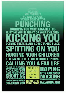
The poster above was designed as part of a advertising campaign against domestic violence, where type and colour were simply used to deliver a crucial message. 

It's simple if the text is not readable it will not be legible, as the viewers will not be able to read what you are saying. Other factors which influence legibility are colour, alignment, and over- lapping text on images. The size of text has to be an average size which can be read without any difficulty. There are two types of type, one being text type- which has been designed to be legible and readable across a variety of different sizes, another one is display type- which has been designed to attract the reader’s attention and pull the reader straight into the text, or article related to the text. This type of text can be more elaborate, expressive and have a stylish look. Alignment can also affect legibility as it can alter the way a certain image or text looks; making it not look professional. It's important that designers consider this and correct or adjust it, so that it fits in and looks appropriate for the viewer to read. 

Below are some examples of illegible typeface..
Type used in a certain free way to create the effect of curls.. is it legible? 

The type used in the image above will not be readable by most of the readers as it is not legible

illegible typography.

 Understanding the use of something simple, such as colour is all it can take to make or break an image!


HOW TO MAKE YOUR TYPE MORE READABLE
When you can't read text online, most people will just have to zoom in to make the text larger. However, a lot more effort requires to go into designing text which can be read, some of which has very little to do with the type itself. Below I will state some of the main factors designers should take into consideration before launching their products out into the public eye. 
  • Layout- this is one of the most important factors as it is the base. The use of grids, white space and images can all have an impact on readability. 
  • Alignment- text can be altered, centered, justified and left or right justified. Each one has its own place in design. Having your text left justified can be the best for long blocks of copy; as having a strong left edge gives the eye an easy place to come back to after reading the end of the line.
  • New paragraphs- these are extreamly important as they act as a short break for the reader and makes things look more neat and in proportion. Weather you indent, or leave a line space before starting a new paragraph it is very important to keep this consistent.


  • Measure-this refers to the length of the line of the text. Long lines will often tire out the eye and make it hard for you to find your way back to the next line. Your measure should be about 45-75 characters long with 66 characters as an often citied ideal. If your design used multiple columns of text you probably want to keep your measures a bit shorter to about 40-50 characters. 
Principle 2: Tone of voice
Getting the right tone of voice..
Because advertising tone of voice is meant to convey a brand's personality, a successful tone of voice will clearly communicate the values of your brand. For example, if you are selling home improvement supplies, you may want your brand's tone of voice to communicate that your company is competent, knowledgeable and helpful. If you are selling clothing to teens, the tone of voice might suggest that your brand is fun, bold and popular in order to grab their attention. One of the most important things you should consider, before presenting your product or company visually is the typeface you use. In the design world typography is equivalent to tone of voice.
 Some of the questions you should ask yourself beforehand are:
·         Does your type relate to the image?
·         What style best suits the theme?
·         Do you want to SHOUT your message or whisper it?
·         How do you want to come across as? This could be relating to the style of your work, for example- modern, funky, fun, bold, informative or serious.
·         Will your type be accompanied by images or will it portray a certain message alone?
·         Where will the type be read? Online, on a billboard, in a brochure, in an advert or on a poster?
·         How can you aim for it to stand out from the crowd?
·         How will it be different and grab the reader’s attention instantly?
·         Will you be clever with what you do?

Different types of tone of voice

Now i will compare two different types of posters in terms of their tone of voice. The poster above was designed as part of a advertising campaign for domestic violence. The message being delivered is crucial therefore the tone of voice will have to compliment this. As you can tell the text at the top of the poster is smaller and duller, then it gradually increases in size and font as the type goes down to the bottom of the poster. This has been done to create an impact and grab the reader’s attention; as the colours of the text and background are both similar at first and then get darker as the text goes down. This helps deliver the message to the audience more effectively, as the visual communicators have thoughtfully used colours which contrast. As you read down the poster you notice the text suddenly becoming clearer and bolder, some being larger in font than others- shocking words like “KICKING YOU”, “RAPE YOU”, “SPITTING ON YOU” have been enlarged to create an emphasis on them, making the audience feel disgusted by the words.
The tone of voice behind this advertisement has been created by the use of capital letters, creating the effect of shouting. The bold typeface also conveys the same message of shouting out at the audience, automatically this on its own highlights the message the campaign is trying to put across to its audience. The contrasting colours have been used to relate to the message and the subtle colour of the lime box in the middle has been used to say ‘there is help out there for the victims’ , the colour of the box is lighter than the rest, creating a gentler effect and showing the victims there is help out there for them! Therefore I think this poster utilizes the tone of voice and legibility, successfully in order to deliver its message against domestic violence. 

The second poster below is also another advertising campaign poster. It’s designed by the NHS and aims to encourage people to quit smoking.
The tone of voice used in this poster has been made incredibly clear through the use of type. The main focus of the poster is on the text in the middle, which has been written in a child-like scrawl instantly telling the reader the quote is by a child. The quote “I’m scared of my mum dying from smoking” is very shocking and will aim to change many parents’ views on smoking and make them think that their child isn't even scared of spiders but more on the fact of losing their mother. This destroys the child’s innocence and highlights the damage which smoking has caused; not only to yourself but your whole family. The poster is also very clear and readable making is legible. This poster is another successful poster in terms of tone of voice and legibility.