The last ITAP lecture was a bit different and challenging, as we
had to figure out the key principles ourselves.
In this blog post
I will talk about how text compliments images and vice versa.
As a visual
communicator using text along with images can greatly increase the impact which
you will have on your targeted audience. This is because the two complement
each other so well and can convey a message in a very simple, straight forward
manner. Illustrators often put great emphasis on text and images from
publications and create handmade images; whereas Graphic Designers are more computers
based.
Without words,
images can be seen as bare and the audience may not always understand what you
are trying to say; so with the use of text you can instantly gain an audience’s
attention, as they will suddenly relate to the image being portrayed.
Designers are very
clever and use text which doesn't always compliment the picture. This
is done because they aim to alter the meaning of the picture and make the
audience think differently to what is actually being said or seen. So not
everything you see is necessarily true! At the lecture we were shown
a variety of different images and the ones below inspired me the most, as I
thought they were very catchy and the message behind them really made you think.
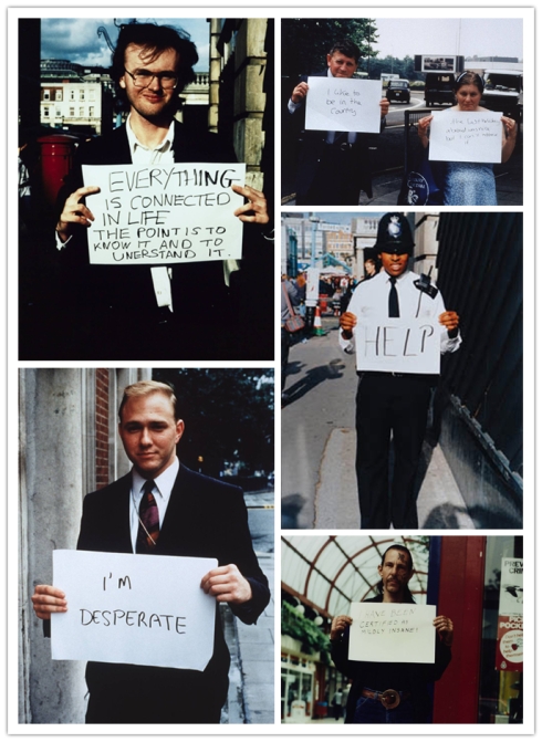
The photographs were taken by Gillian Wearing called, "The signs what you
want to say, not what someone else wants you to say", behind the signs are
individuals who are going about their daily life. However when they put the
signs up you can tell that they are not necessarily happy in what
they are doing; as the signs say something totally different to their facial
expressions and body language.

Images of individuals put on the spot to say the first thing on their mind about how they feel.
By Gillian Wearing
Images can only tell you a story according to your own personal observations and how you perceive them. Each image can be taken by a different meaning and this all depends on how and why you think in that certain way. This is the reason why text is needed along side images, so that everyone understands the meaning of them and the same message is being conveyed across to all the audience.
No comments:
Post a Comment