.jpg)

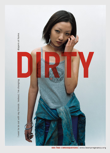
Above you can see the photographs which were photographed for a pregnancy awareness campaign. I found this very influential as it's so different and an eye opener to many of the viewers out there. It is such a sensitive issue which most of the public avoid talking about; therefore I admire the way the campaign have portrayed themselves in such a powerful way, which is more than likely to leave an impact in their lives. I think the posters are very good as people can relate to them as if it were them themselves and this will make them feel more of a connection to the posters and what is being said. The use of such strong vocabulary such as 'cheap', 'dirty', 'nobody' and quotes saying 'all it took was one prick, just one prick to get my girlfriend pregnant' all capture the public's attention and make them think deeply into the issue itself. By using such word's you get such an emotional response from your viewers.
Many people stereotype teenage girls who become pregnant calling them 'cheap' as they may have had a one night stands etc. The images used by Tony capture how these teenage girls may feel and I am sure they will be able to relate to them exceptionally well, which is the main aim. All of these pictures above create an emphasis on the thoughts of them seeing them self as cheap uneducated human beings, the use of body language and facial expressions all impact the way the viewer thinks of themselves; as they are constantly comparing themselves together. Through the images you can clearly see the guilt and disgust in their eyes and the use of correct typography just gives it that extra meaning; which arouses emotion in the viewers. The words written in bold red font make them stand out much more than if they were to be dull and smaller in size. This emphasizes the main message behind the images and creates emotion and deeper meaning beneath the image itself.
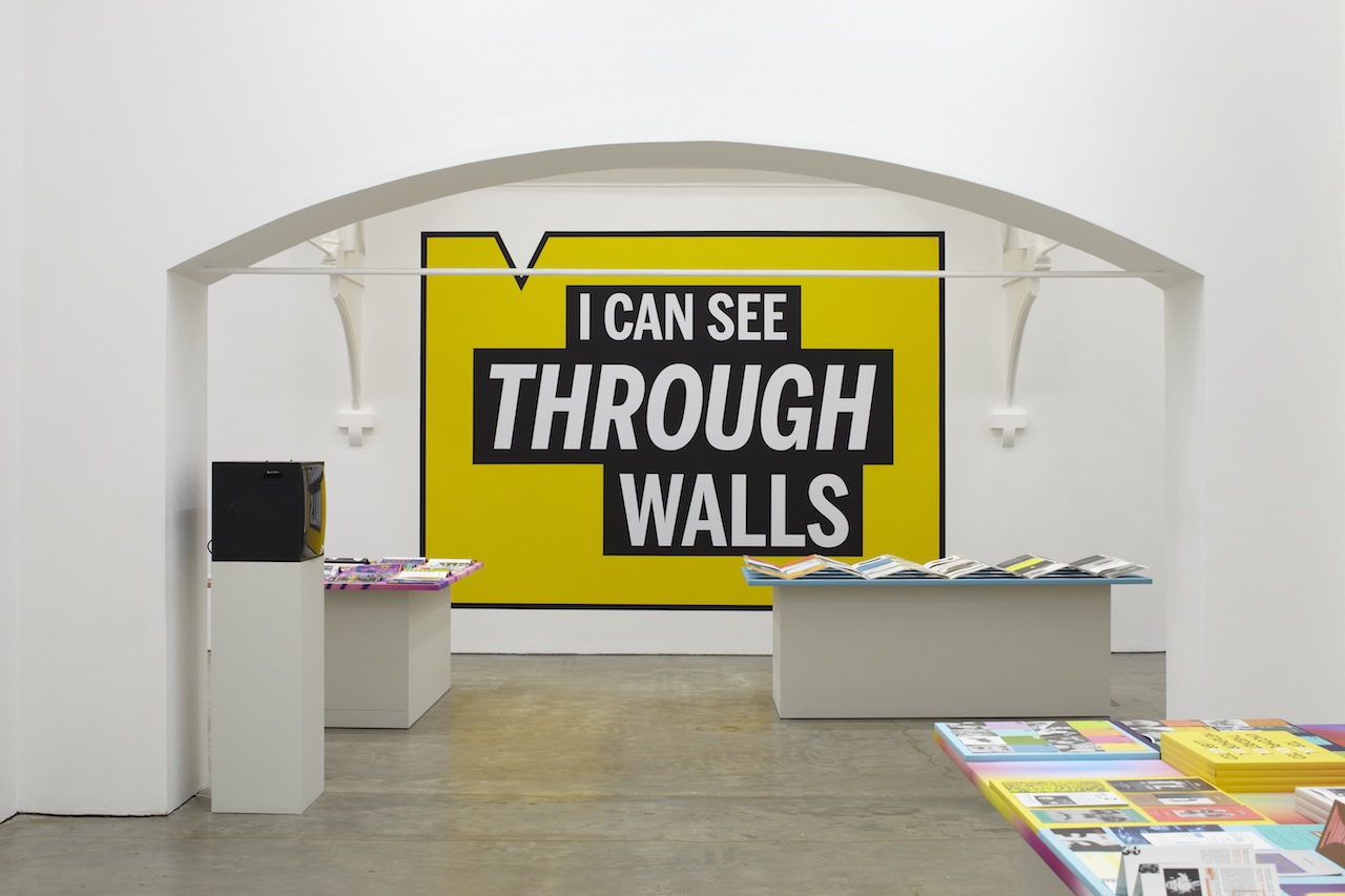
Tony was very well known to use bold typography in his visual work along with the sharp eye-catching colours used to instantly grab peoples attention. The use of the bright colours in the image above automatically develops an eye catching visual. I am inspired by the way something so simple such as colour can change the whole perspective and the response you get. The image above is a great example of a eye-catching visual as it draws attention to the typography straight away. Likewise the use of a big, bold, bright typeface helps give that powerful dramatic element to his work. Finally the use of 3 minimal colours and white space help maintain all of the attention of the typography in the middle, rather than distracting you from the main issue. Overall my visit to the Ikon Art Gallery in Birmingham was a great success and an eye opener to some of the Tony's work which I found very beneficial. In the future I will explore more openly as Tony was so open minded this has also influenced me to not be scared and try out things out of your comfort zone- to create something out of the norm!
No comments:
Post a Comment